Statcast Data Visualization in R
Note: This article was originally posted at Simple Sabermetrics. I post articles monthly on the Simple Sabermetrics blog and soon after re-post it here on my Medium account.

In my last Simple Sabermetrics post, I covered how to manipulate Statcast data using R. The goal of these posts is to help individuals learn important aspects of coding from the ground up, so we are going to build off the previous post in this one. If you’re just getting started, the data manipulation article is for you.
For this post we will be using the same data we used in the last post from Baseball Savant’s Statcast. This includes both the ‘NL_CY’ and ‘NL_ROY’ data frames that we created using the dplyr functions we learned about in that post, as well as new data frames we will create for the purpose of this article. Now we will take it a step further and dive in an aspect of baseball analytics that really interests me — data visualization!
Before we begin I would like to introduce the ggplot2 package in R. This library is a data visualization package that makes complex plots easy to create. It is the most common data visualization package that the R community uses, which in turn makes it easy to troubleshoot errors and learn more about the extensions of the library.
I have provided the code in this article, but I have also packaged it into an R script on my Github (and the Google Drive link for the CSV file). Feel free to download the script there to follow along. As always, please reach out with any questions. Let’s get started!
Bar Chart
The first visualization I want to start with is a bar chart. A bar chart is used to compare different groups or categories against a numerical value. In this example we will use the three 2020 Cy Young finalists and track the number of fastballs over 95 miles per hour for each pitcher.
This first chunk of code is the dplyr code necessary to manipulate the ‘NL_CY’ data frame to filter for each pitcher’s total number of fastballs thrown above 95. This code should look very familiar if you have read my previous article.
FB_over_95 <- NL_CY %>%
  filter(pitch_type == "FF") %>%
  group_by(player_name) %>%
  summarize('95+' = sum(release_speed > 95, na.rm = TRUE))
Next, this chunk of code is an outline of the bare minimum code to create a bar chart with the newly created data frame. We use the ggplot() function to input the data frame name and variables to place on the x and y axes. The geom_bar() function is attached with a plus sign (+) to show a string of code linked together. The plot this creates is not shown in this article, but if you are curious to see what it looks like I encourage you to do it on your own or download the script from the Github linked above.
ggplot(FB_over_95, aes(x = player_name, y = `95+`)) +
  geom_bar(stat = "identity")
Finally, multiple arguments are added to finalize the aesthetics of the visualization in the third chunk of code. This includes adding color to the bars, labels to the axes and plot title, altering the theme and removing the legend.
ggplot(FB_over_95, aes(x = reorder(player_name, -`95+`), y = `95+`, fill = player_name)) +
  geom_bar(stat = "identity") +
  labs(x = "Pitcher", y = "", title = "Number of fastballs over 95 MPH") +
  theme_bw() +
  theme(legend.position = "none")
From this bar chart we can see that Jacob deGrom consistently threw faster than the other two finalists in the 2020 season. It’s one thing for a pitcher to have an average fastball velocity at or above 95 MPH, but to throw this many fastballs above that threshold is quite impressive.
Density Plot
After noticing that deGrom is far ahead of the other two, we can take this a step further and examine deGrom. If we wanted to see the distribution of deGrom’s fastball velocity, we would instead create a density plot to do this.
Similar to the previous section, the following code is the manipulated data frame to filter to just deGrom’s fastballs, a bare minimum outline of the density plot code, and the final version of ggplot code to create the visualization you see below.
Fastballs_deGrom <- NL_CY %>%
  filter(player_name == "Jacob deGrom", pitch_type == "FF")ggplot(Fastballs_deGrom, aes(x = release_speed)) +
  geom_density()ggplot(Fastballs_deGrom, aes(x = release_speed)) +
  geom_density(color = "red", fill = "lightblue") +
  labs(x = "Velocity (MPH)", title = "Distribution of Fastball Velocity") +
  theme_bw()

From this density plot we can gather that deGrom most commonly throws his fastball in the 98.5 to 99.5 MPH range, reaching up to almost 102 MPH as well.
Box Plot
A box plot is similar to a density plot in that it shows the distribution of values. The difference is that a box plot focuses on the minimum, first quarter, median, third quarter, and maximum values. It is also important to note that the data distribution is hidden in each box, compared to the density plot where you can see where the values most frequently occur.
In this box plot we will refer back to the three Cy Young finalists and measure the distribution of their fastball velocities. Yet again, Jacob deGrom consistently throws harder than the other two pitchers.
Fastballs_NL_CY <- NL_CY %>%
  filter(pitch_type == "FF")ggplot(Fastballs_NL_CY, aes(x = player_name, y = release_speed)) +
  geom_boxplot()ggplot(Fastballs_NL_CY, aes(x = player_name, y = release_speed, fill = player_name)) +
  geom_boxplot(width = 0.5) +
  labs(x = "Pitcher", y = "Velocity (MPH)", title = "Distribution of Fastball Velocity") +
  theme_bw() +
  theme(legend.position = "none")

From this box plot we can see the different ranges that each pitcher lives in with their fastball velocity. Instead of just looking at averages or maximums of velocity, we can truly see the ranges of values and percentiles.
Scatter Plot
For the past three visualizations we have focused on the distribution of the data and have not looked into the individual instances of each pitch. A scatter plot measures the relationship between two numeric variables. In this case, we are comparing Devin Williams’ pitch velocities to spin rate.
Since we are plotting each individual pitch of the data frame, there is no dplyr code needed to manipulate the data. The final chunk of code introduces new functions we have yet to see, so let’s quickly touch on them.
The scale_x_continuous() and scale_y_continuous() tell ggplot the limits of the x and y axes, as well as where to place the breaks on the axis. I chose to remove a couple of outliers and focus on where most of the data occurs, so this is why the code was inputted. Additionally, we increased the size of the individual instances by telling the geom_point() function the points should be size 2.
ggplot(NL_ROY, aes(x = release_speed, y = release_spin_rate, color = pitch_type)) +
  geom_point()ggplot(NL_ROY, aes(x = release_speed, y = release_spin_rate, color = pitch_type)) +
  geom_point(size = 2, na.rm = TRUE) +
  scale_x_continuous(limits = c(80,100), breaks = c(80,85,90,95,100)) +
  scale_y_continuous(limits = c(2000,3250), breaks = c(2000,2250,2500,2750,3000,3250)) +
  labs(x = "Velocity (MPH)", y = "Spin Rate (RPM)", color = "Pitch Type",
       title = "Devin Williams Velocity vs. Spin Rate") +
  theme_bw() +
  theme(legend.position = "bottom")

If you aren’t familiar with “normal” spin rates for fastballs and changeups, keep in mind that Devin Williams changeup is a freak of nature. Comparing the relationship between velocity and spin rates in pitches is a common way to differentiate between pitch types. A scatter plot is the most common tool to compare relationships between numeric variables and will be shown frequently on this blog throughout the next few posts.
Scatter Plot — Correlation
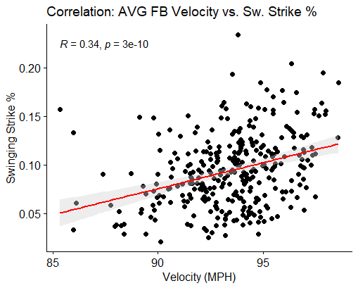
A scatter plot can also be used to measure the correlation between two numeric variables. Similar to the previous example, we are plotting variables on the x and y axes. For this example we want to see how the velocity of a pitcher’s fastball affects their swinging strike percentage. From this correlation below we can see that there is a minor correlation between throwing hard and inducing more swing and misses. Click here to read more about correlation.
cor_df <- statcast_data %>%
  filter(pitch_type == "FF") %>%
  group_by(player_name, pitch_type) %>%
  summarize('n' = n(),
            'mean_release_speed' = mean(release_speed, na.rm = TRUE),
            'sw_str_percentage' = sum(description %in% c("swinging_strike", "swinging_strike_blocked"))/n()) %>%
  filter(n > 100, mean_release_speed > 85)ggscatter(data = cor_df, x = "mean_release_speed", y = "sw_str_percentage",
          add = "reg.line", cor.coef = TRUE, cor.method = "pearson",
          conf.int = TRUE, add.params = list(color = "red", fill = "lightgray"),
          xlab = "Velocity (MPH)", ylab = "Swinging Strike %",
          title = "Correlation: AVG FB Velocity vs. Sw. Strike %")

This scatter plot looks slightly different than the previous one we covered, and that’s because it’s from a different package than ggplot2. This ggscatter package is a sister library and is most commonly used for this tool. Be on the lookout for these kinds of plots in articles that cover most statistical methods and baseball analytics.
Line Plot
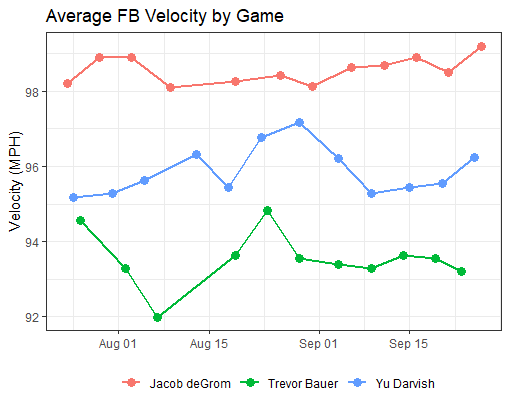
A line plot is a scatter plot where the dots are connected to represent a trend or series of time. A time series plot is an excellent method to observe trends in athletes, and is a very critical tool used by a baseball analyst. In this example we are examining the average fastball velocity by game for our three Cy Young finalists.
The code below includes a data type transformation. We are transforming the “game_date” variable to show up as a date type, rather than a character type. This will allow us to graph a string of chronological dates on the x-axis.
NL_CY$game_date <- as.Date(NL_CY$game_date)time_df <- NL_CY %>%
  filter(pitch_type == "FF") %>%
  group_by(player_name, pitch_type, game_date) %>%
  summarize('n' = n(),
            'mean_release_speed' = mean(release_speed, na.rm = TRUE))ggplot(data = time_df, aes(x = game_date, y = mean_release_speed, group = player_name)) +
  geom_line() + geom_point()ggplot(data = time_df, aes(x = game_date, y = mean_release_speed, group = player_name, color = player_name)) +
  geom_line(size = 1) + geom_point(size = 3) +
  labs(y = "Velocity (MPH)", title = "Average FB Velocity by Game", color = "") +
  theme_bw() +
  theme(legend.position = "bottom", axis.title.x = element_blank())

Some observations we can make from this visualization are that Jacob deGrom (again) consistently throws hard, Yu Darvish saw a spike in velocity in late August, and Trevor Bauer saw a significant drop in velocity over the course of the first three games of the season.
Wrapping It Up
Data Visualization is a critical component to being a successful baseball analyst. Supplementing various analytic tasks with some sort of graph, chart, plot, or even table allows your intended audience — in this case a coach or staff member — the ability to better understand the message you are trying to communicate.
The R package used in this article — ggplot2 — is the most common library used in the R community. This means that there are an endless amount of resources to further develop your skills visualizing information in the R programming language. Here are a few resources to check out that have been particularly useful to me in the past.
